An alternate view of fading on inkjet printers

Introduction
A lot has been written about the longevity of prints made on various inkjet printers, but most of the hard data that has been published to date has been on a limited range of inks and papers, usually on those products supplied by the printer manufacturers. Since conventional longevity (the lack of fading) testing is done under controlled conditions and can be quite time consuming and expensive, it is understandable that only large companies with a sizable market share would be willing to pay to have their inks/papers tested. This information is useful for those who use the OEM ink and paper, but there are a large number of serious hobbyists who either refill their ink cartridges of buy prefilled 3rd party cartridges and who have no access to similar data on their inks and papers. Because of the lack of this information, several of us decided to gain a little knowledge on this subject and to try to develop some “quick-and-dirty†testing techniques that would allow individuals to run “order of magnitude†longevity tests in a reasonable time and at a reasonable cost. It is the purpose of this report to summarize what we have found, and to show others how they can undertake similar UV testing on their own.
Let us start by stating: “Yes, we know that what we have done isn’t nearly as rigorous as the testing that has been done by others and that it is not as accurate/precise as the work done by others (e.g. Kodak, Wilhelm and Livick).†However, even imperfect information is almost always better than no information at all; hopefully this will start a dialog with others that will improve everyone’s knowledge and understanding of this subject. This is in keeping with work such as that published by DellaFave. The authors wish to remain anonymous, and will answer questions only through the “Nifty-Stuff†forum. Any attempts at contact though private e-mails will be ignored.
We also know that we probably didn’t test your favorite ink or paper. Being practical people, we chose to do most of our tests on the products that we use, and we didn’t worry about testing every ink and paper on the market. If you want information on some other ink/paper combination, feel free to test it (our UV test procedures are given below) and post the results for others to share. This has been quite a time consuming process for the past several months, and we do not wish to become the world’s test site for 3rd party ink/paper longevity.
Fading is much more complicated than is usually realized, and IOHO an ink/paper combination cannot be represented by a single “lifetime†number. A rather obvious example is that light prints appear to fade more quickly than dark prints, simply because dark prints have more ink that can be faded. For example, “high key†prints don’t use a lot of ink, and these prints will appear to fade much more quickly than conventional prints. This and other important factors (which will be discussed later) makes giving a single “longevity number†impossible from our tests. We are presenting a LOT of data and we prefer that each individual look at the raw data and form their own opinions about what they see. We encourage you to post your opinions on what you see on the Nifty-Stuff forum. We will give some overall impressions of what we saw and learned, but you will need to remember that (like beauty): “Fading is in the eye of the beholderâ€.
In an effort to get this information out as quickly as possible, this document was not complete at the time of its initial publication. It will be modified to fill in missing information and to answer relevant questions that are raised after the initial publication.
Experimental
Since the three of us all use Canon BCI-6 carts, we obviously concentrated on inks used in Canon printers. We were able to collect a wide range of ink/paper samples from various sources. We also got a few “benchmark†samples that have been rated by Wilhelm so that we would have a few references to compare with our samples. The printed samples sent this image to the printer. For those who are into color management, this single image is in the sRGB color space and all of the other images use the aRGB color space except for the ozone scans (which do not have an assigned color space). The following is a list of the samples that were tested (we recommend that you print this list and keep it for reference as you look at the various images):
1. Kodak conventional print
2. FCA test chart from Costco
3. PPPro/Formulabs printed test chart
4. PPPro/Formulabs printed test chart coated with non-UV absorbent acrylic spray (from Wal-Mart)
5. PPPro/Formulabs printed test chart coated with ClearShield UV absorbent acrylic clear coat
6. Kirkland 8.5×11 paper/Formulabs printed test chart
7. Kodak Ultima paper/Formulabs printed test chart
8. Ilford Classic Pearl paper/Formulabs printed test chart
9. Kirkland 4×6 paper/Formulabs printed test chart (this paper is different than the 8.5×11 paper)
10. FCA test chart from Costco coated with ClearShield UV absorbent acrylic clear coat
11. PPPro/Canon swabbed ink test
12. PPPro/Canon swabbed ink test with extra pigmented black strip on bottom coated with ClearShield UV absorbent acrylic clear coat
13. PPPro/Formulabs swabbed ink test
14. PPPro/G&G swabbed ink test
15. PPPro/WeInk BCI-7 swabbed ink test
16. Kirkland 8.5×11/Canon swabbed ink test with extra pigmented black strip on bottom
17. ICP/Canon swabbed ink test with extra pigmented black strip on bottom
18. Kodak Ultima/Canon swabbed ink test with extra pigmented black strip on bottom
19. Epson Glossy PP/Canon swabbed ink test with extra pigmented black strip on bottom
20. Kirkland 8.5×11/WeInk BCI-7 printed test chart
21. Ultima/WeInk BCI-7 printed test chart
22. Kirkland 8.5×11/BIJC#2 printed test chart
23. Ultima/BIJC#2 printed test chart
24. Kirkland 8.5×11/Canon OEM printed test chart
25. Ultima/Canon OEM printed test chart
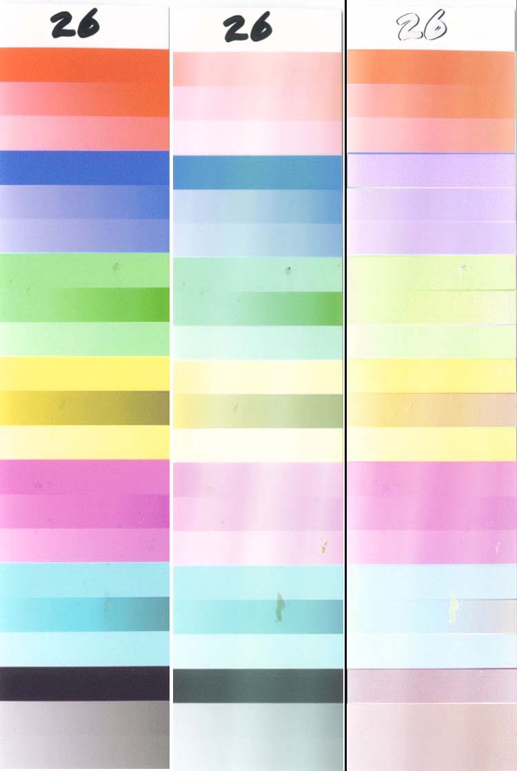
26. Same as test 6, but with the “Intensity” set to -20 printed test chart
27. Same as test 6, but with the “Intensity” set to +20 printed test chart
28. ICP/Formulabs printed test chart coated with 2 layers of ClearShield (plus edges)
29. Kirkland 8.5×11/Formulabs printed test chart coated with 2 layers of ClearShield (plus edge
29a. Same as 29, but with single dip in ClearShield, edges sealed
29b. Same as 29, but with single dip in ClearShield, edges not sealed
29c. Same as 29, but with single dip in 25% ClearShield/75% water, edges sealed
29d. Same as 29, but with single dip in 25% ClearShield/75% water, edges not sealed
30. Kirkland 8.5×11/HP ink printed test chart printed on HP 9650 using #57 & #58 carts
31. Premium Plus HP Photo Paper High Gloss Ultrabrilliante 280 gsm 11.5 mil/HP ink printed test chart printed on HP 9650 using #57 & #58 carts
32. Epson Premium Luster paper/Epson pigment inks printed test chart printed on Epson 7800
33. Ultima/Formulabs printed test chart coated with 2 layers of ClearShield (plus edges)
34. Kirkland 8.5×11/MIS printed test chart
35. PPPro/MIS printed test chart
36. PPPro/Canon OEM printed test chart
37. Canon PPPlus/Canon OEM printed test chart
38. Epson Glossy PP/Canon OEM printed test chart
39. ICP/Canon OEM printed test chart
40. Same as sample 31, but cut from left edge
41. Same as sample 31, but cut from right edge

OZONE Fading UV Fading
Discussion
The preceding animations were included to peak your interest in this subject enough to convince you to suffer through still more of this boring information that is required to understand the data.
After you have finished reading the boring stuff, here are links to a pair of folders containing PDF animations for all of the samples on a single composite image. Because some browsers do not properly display animations, download them from each folder (right click on the PDF Animation and select “Save as†to save them on your computer) and then display them with Adobe Acrobat. This shows the effects of UV (light), and this shows the effects of ozone. The various samples in the UV animation were tested for different times depending on the fading rate of each sample, so this presented a problem of what to do when preparing the UV animation for times that exceeded a sample’s test time. When this happened, a diagonal black line was drawn through the last image available, and the actual test time for that sample was noted in blue.
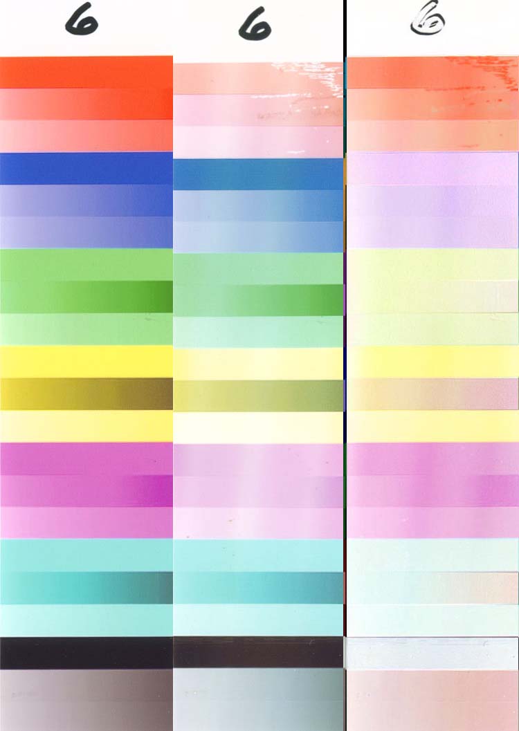
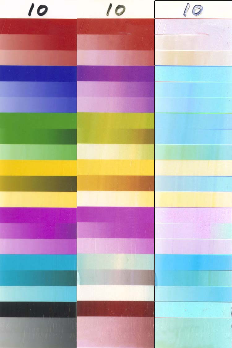
Samples 1, 2, 31 and 32 are of special interest, as these samples have been rated by Wilhelm at roughly 20, 40-60,>100 and 60 years, respectively. These samples can be used as “baselines†to judge all other samples by.
Because there is so much data and because we each see things differently, the raw images are all available for download. There are separate folders for the UV and OZ (Ozone) data, as well as a summary folder. These images were generated by scanning each sample before testing started, and then again at periodic intervals during the test. Each sample was scanned at 200 dpi with all corrections turned off so that the scans could be compared with each other. The UV and Ozone scans were made on different scanners and on different (but hopefully identical) samples, so UV scans should not be compared with ozone scans.
UV Testing
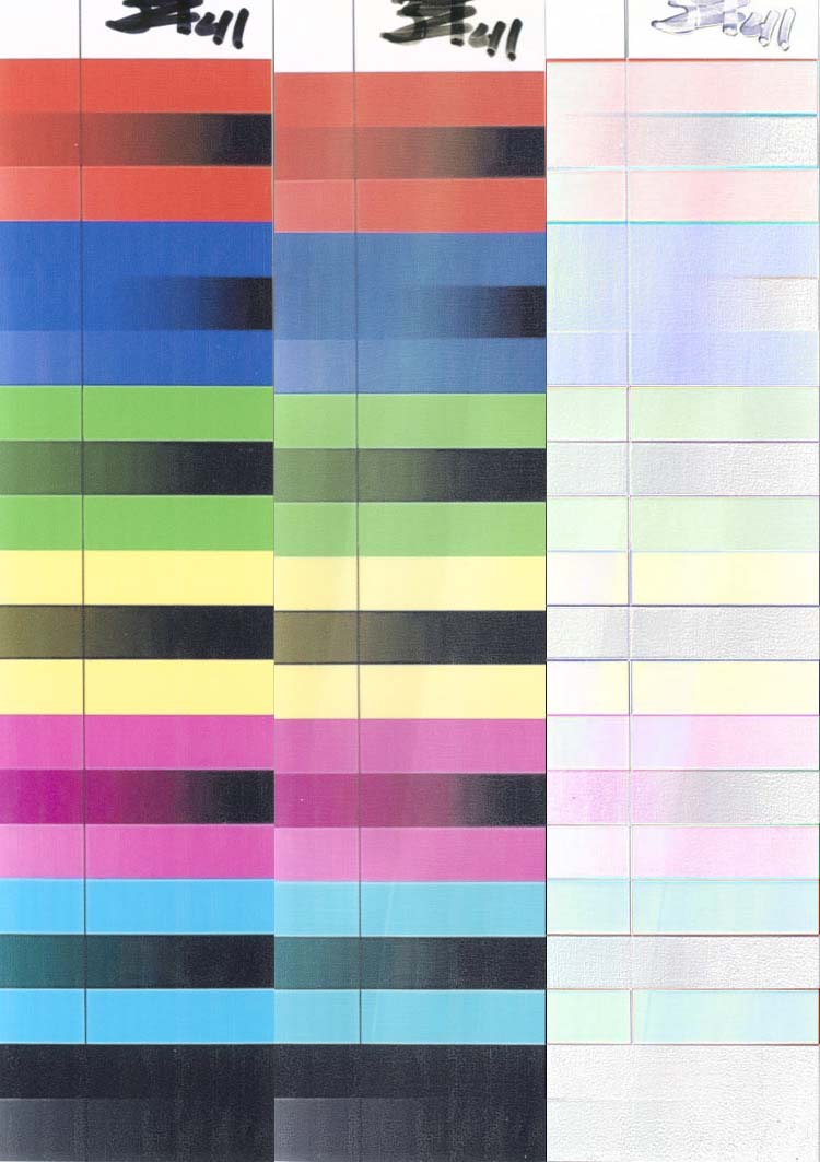
The UV samples were each tested individually, and there is a separate directory for each sample. The file name gives the sample number, that it was a UV test (“_U_â€) and the number of hours under test. There are also “Diff†versions of each file, where each “Diff†Image contains the initial (time “0â€) image, the image after fading for this time, and a “Difference†image where the two previous images were overlaid, the top image blended with a “Difference†mode in Photoshop, and then inverted so that any change from white shows the colors that have changed as the sample faded. Note that these samples usually shrunk from the heat during testing, so the faded images were usually slightly shorter (by 1-2%) than the original image. In order to get the scans to line up properly for the “Difference†image, a vertical scaling operation was usually performed on the faded layer in the difference comparison – this explains why the middle image in a “Diff†is often slightly shorter than the other images. There are also PDF “Animations†in each folder that show all of the “Diffs†in sequence, advancing to the next image each second and looping back to the start after it is complete. IOHO, this is the preferred way to look at the detail in a single sample.
The ozone test procedure was different in that several samples were mounted together and tested as a unit. For this reason, most ozone test scans contain multiple samples. Also, the “Diffs†only give the differences. Since the original data is available, you are free to download the raw images and generate whatever formats you desire. The final numeric value in each file name represents the number of minutes under test in the ozone chamber.
The UV and ozone summary folders gives animations of a composite of all samples, as well as the individual composite images used to generate the animations, both in their original (large) form and their reduced size (small) form. Plan on spending a LOT of time looking at these animations, but only AFTER you have finished reading this boring stuff.
Kodak has an interesting paper on various factors that are related to fading – starting about 1/3 of the way down (after a discussion of how their photo paper improves longevity). It is a good place to become acquainted with some of the details of fading.
As was mentioned earlier, we were looking for ways to run very accelerated fading tests, and we were successful in developing such tests for ozone and light fading. The light fading test turned out to be the easier of the two to develop. Wilhelm uses fluorescent lighting for their light source, and Livick preferred natural sunlight. This post, and several of the posts that follow it, shows that the lighting at various points in a house is quite different, not only in the overall light levels (Lux) that are present, but also in the wavelengths that are present in the light. Why are the wavelengths so important – because shorter wavelengths cause more fading damage than longer wavelengths, as shown in this link. Depending on where you mount your prints and the type of light that falls on them, you might prefer to use sunlight, fluorescent or even tungsten lighting (or some combination of the three) for your fading tests – valid arguments can be made for any of them.
We ended up choosing fluorescent lighting, mainly because we found that “Compact Fluorescent Lamps†(CFLs) were of a size and shape that allowed us to directly mount samples where we could achieve up to 150,000 Lux (about 50% more than direct mid-day sunlight) for 24 hours/day. This link shows that there is a significant amount of UV radiation in light from a fluorescent lamp. 150,000 Lux is far higher than the light levels used by Wilhelm or Kodak, but the principle of “reciprocity†states that the fading is based on Lux-hours, regardless of the light levels used. Actually, Wilhelm has reported that this is not exactly true, and that very high light levels are not as effective at fading as are low light levels for the same total Lux-hours of exposure – as much as a factor of 3 at the peak light levels that Wilhelm tested. We also did not control the temperature and humidity (as is usually done by others) – remember that this is a “quick-and-dirty†test, not a rigorous scientific test. Specifically, the temperature on our tests was quite a bit higher than on the tests by others – about 160 degrees F. This is about 90 degrees F (50 degrees C) higher than the other tests, and according to the standard “rule of thumb†for the speed of such reactions, this could result in as much as a 32:1 increase in the fading rate. The fact that these “correction factors†are so large and unknown led us to the position that our results cannot be used to directly predict how long a particular ink/paper combination will take to fade, but that it would be more prudent to fade a few “baseline†reference samples on the same test setup and to compare unknown test samples to the baseline samples with accepted longevity ratings to form your opinion. Even this is far from foolproof, as different samples might react differently to the higher light levels and temperatures of our tests, but it is the best that we can do with our simplified test procedures.
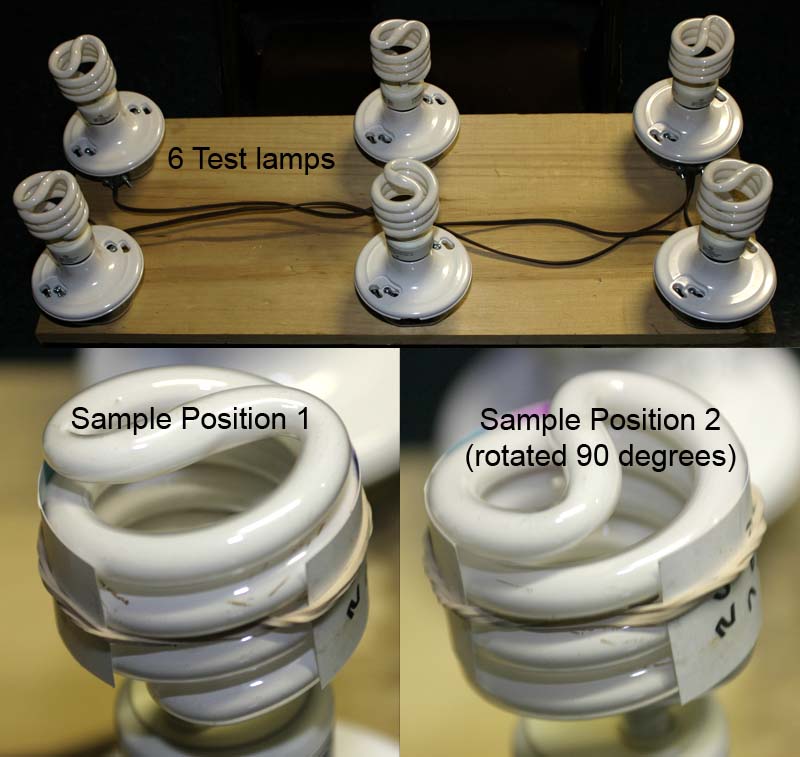
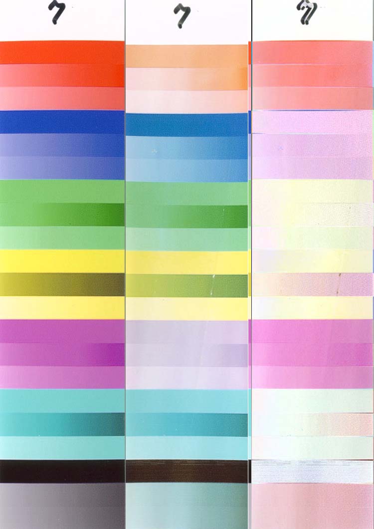
The test setup is shown here, and is simplicity itself. Six light sockets were mounted on a common surface and six 23 Watt CFLs (“100 Watt Replacementâ€) were installed. They were purchased from Costco, with the name “FEIT Electric†on the package. Note that it is not unusual for different fluorescent lights to have different light output and a different distribution of wavelengths, so if you want to replicate any of these tests or compare your own tests to our tests, try to use the same CFLs. You will note that a spiral pattern is visible on many of the samples after they are faded, since there is obviously more light and heat where the sample touches the lamp than in between the coils of the lamp. To minimize this problem, the samples were rotated by 90 degrees (moving the samples so that the coils were directly between where they were for the previous test) each time that they were reinstalled after scanning (every 24 hours). Because there is no guarantee that each lamp has the same light/UV output, each test sample was advanced to the next lamp each day (in addition to being rotated). A pair of rubber bands was used to hold each sample in place – two were used just in case one broke (which happened occasionally). Since the intense UV and heat rapidly degraded the rubber, these bands were replaced every day to minimize such failures and prevent a sample from falling off of its lamp (which never happened, due to the “two band†procedure). Each sample was cut from the center 1.25†of a 4×6†test print, but only about the center ¾â€ of this width actually received the full light exposure – the edges did not receive nearly the same intensity of light and heat and did not fade as much, as will be seen on numerous samples – for example.
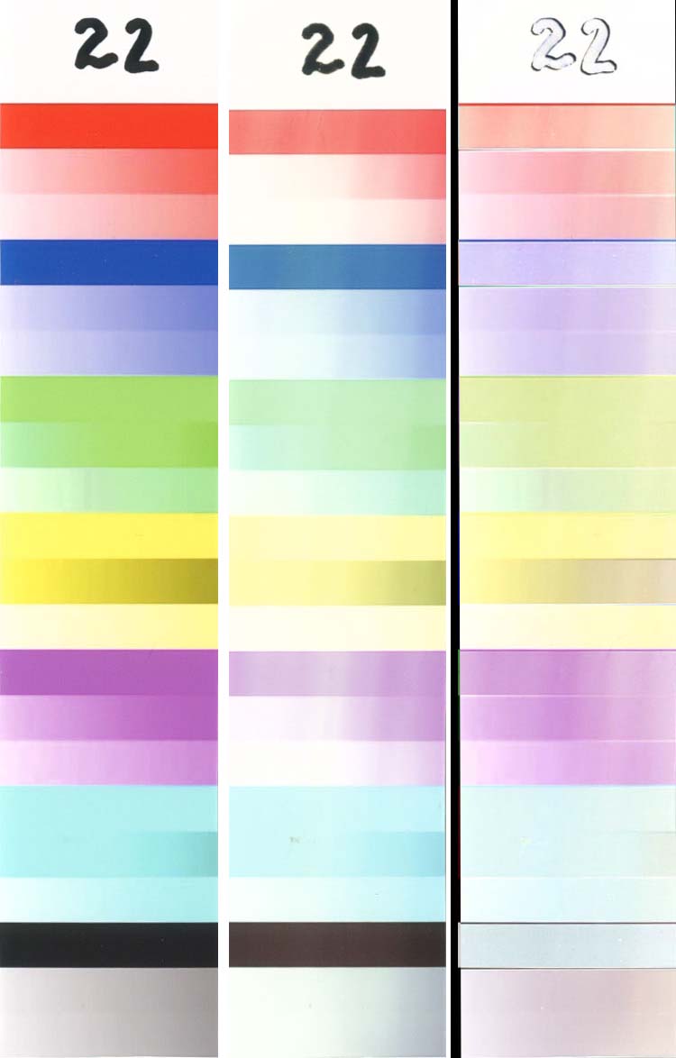
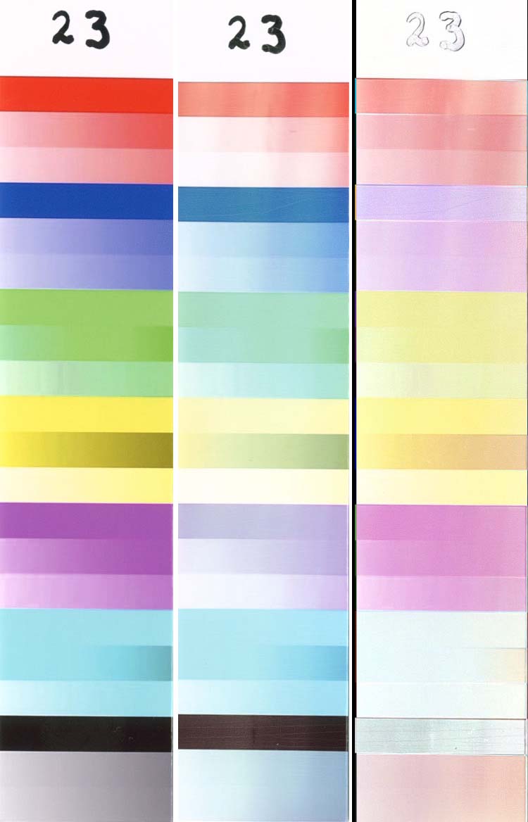
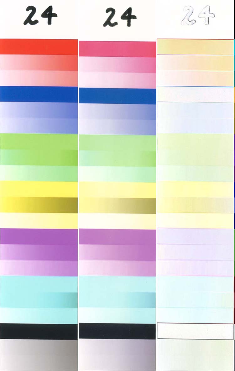
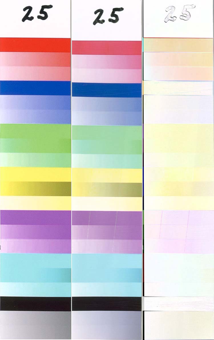
It was previously mentioned that “High Key†prints will appear to fade more quickly than darker prints. Sample 26 and sample 27 were printed minutes apart on the same printer using the same ink and paper, but 26 was printed with the “Intensity†(in the printer driver) set at -20, while 27 was printed at +20. Notice that the faded sample (the center portion of each “Diff” image) of 27 looks much better than 26, even though the loss of color (the right portion of each “Diff” image) is more severe on 27. The moral of this story is that you will get a longer “useful†life from your prints if they have more ink when they are printed. There are obviously limits to how far this can be carried, but it is surprising how much latitude you have to lighten/darken most prints without making them look unnatural.
This also has other important implications that you must bear in mind when looking at the various images in these tests – a darker image will always appear to show less fading than a lighter image, everything else being equal. It is impossible to get exactly the same color density on every image, especially when they are printed on so many different printers (most of them not profiled) with so many different inks, so we had to accept each sample as it was printed, regardless of how dark or light it appeared in comparison to the other samples. For this reason, when comparing various samples be sure to look at how dark each color was in the initial print when you judge how good a faded sample looks.
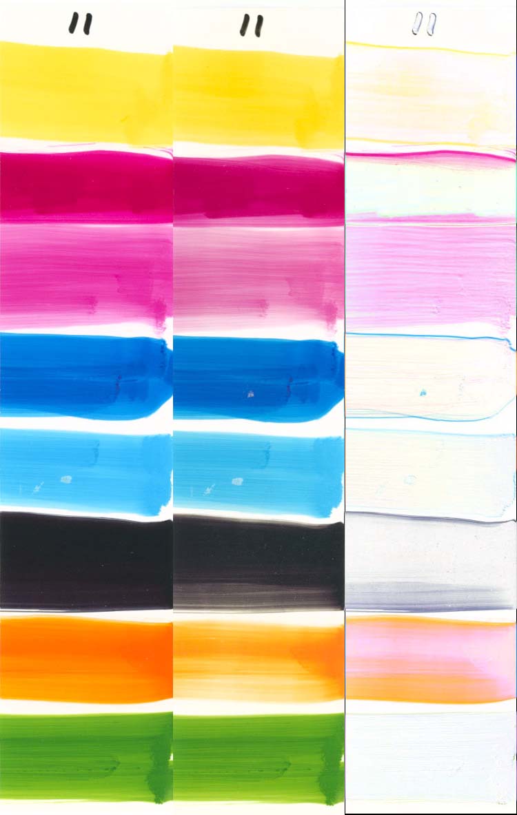
We also included a number of “swabbed†charts (Samples 11-19), where individual inks were painted onto the paper using a cotton swab (Q-Tip). We have been doing this for some time, and we know that there is no way to paint inks in this fashion and get a reliable/uniform coverage, but we wanted to see if we could isolate which inks were the most prone to fading. The printed test charts are a far better way of laying down the ink to get a reliable/uniform coverage, but each color that is printed is a mixture of inks, so it is impossible to isolate which ink is responsible for fading. For example, how do you separate Magenta and Photo Magenta on a printed sample? The biggest downside of swabbing is that the ink is applied in a much heavier coat than on typical prints, and these samples will therefore appear to be much less prone to fading than printed samples that use the same ink and paper.
A number of our samples were coated with ClearShield, as recommended by Livick (about ½ way down the page). We are far from expert at applying this coating, especially over swellable papers (where it may be necessary to apply a solvent based spray coating first). It is easy to leave brush marks that are visible on the finished print, and further experimentation will be required to determine a satisfactory method of application.
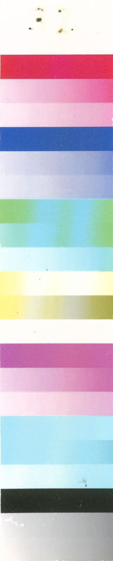
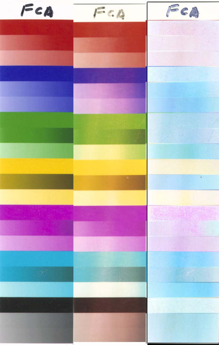
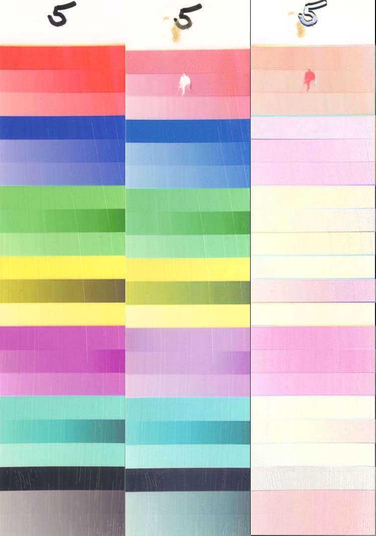
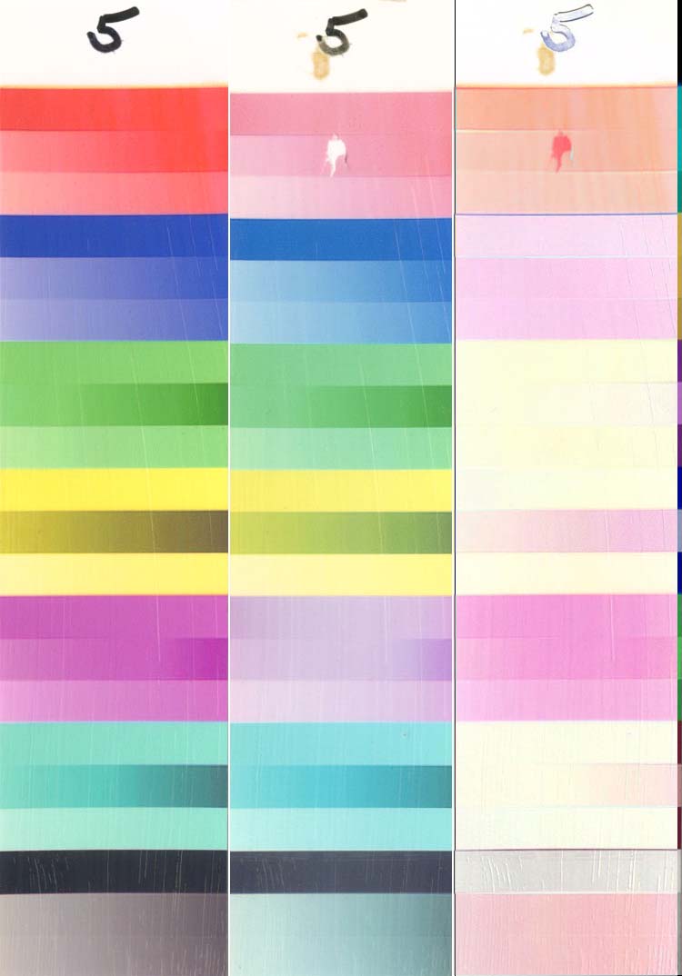
It was previously stated that “Fading is in the eye of the beholderâ€. This statement needs a lot of explanation and clarification, even in addition to the information that was just presented. Sample 2 is a Fuji Crystal Archive print (rated at 40-60 years by Wilhelm) after 7 days of exposure. Clearly, the Cyan has faded, but the Magenta and Yellow show very little fading. If you print mainly portraits, your most important colors are Magenta and Yellow, since they are the dominant colors in flesh tones (there is also some Cyan, but a loss of cyan is far less noticeable than a loss of Magenta or Yellow), and this degree of fading might still be acceptable. OTOH, if you print landscapes with lots of blue sky, a loss of Cyan would result in Magenta skies, so this degree of fading would always be unacceptable. A third example would be if you printed black and white images. Look at the gray gradient at the bottom – it should be close to a neutral gray (as it is on the left). The loss of Cyan gives a strong red cast to the gray, and this much fading would be well past acceptable for B&W printing. This is why each of us has to look at the images to decide how much fading is acceptable in our situation.
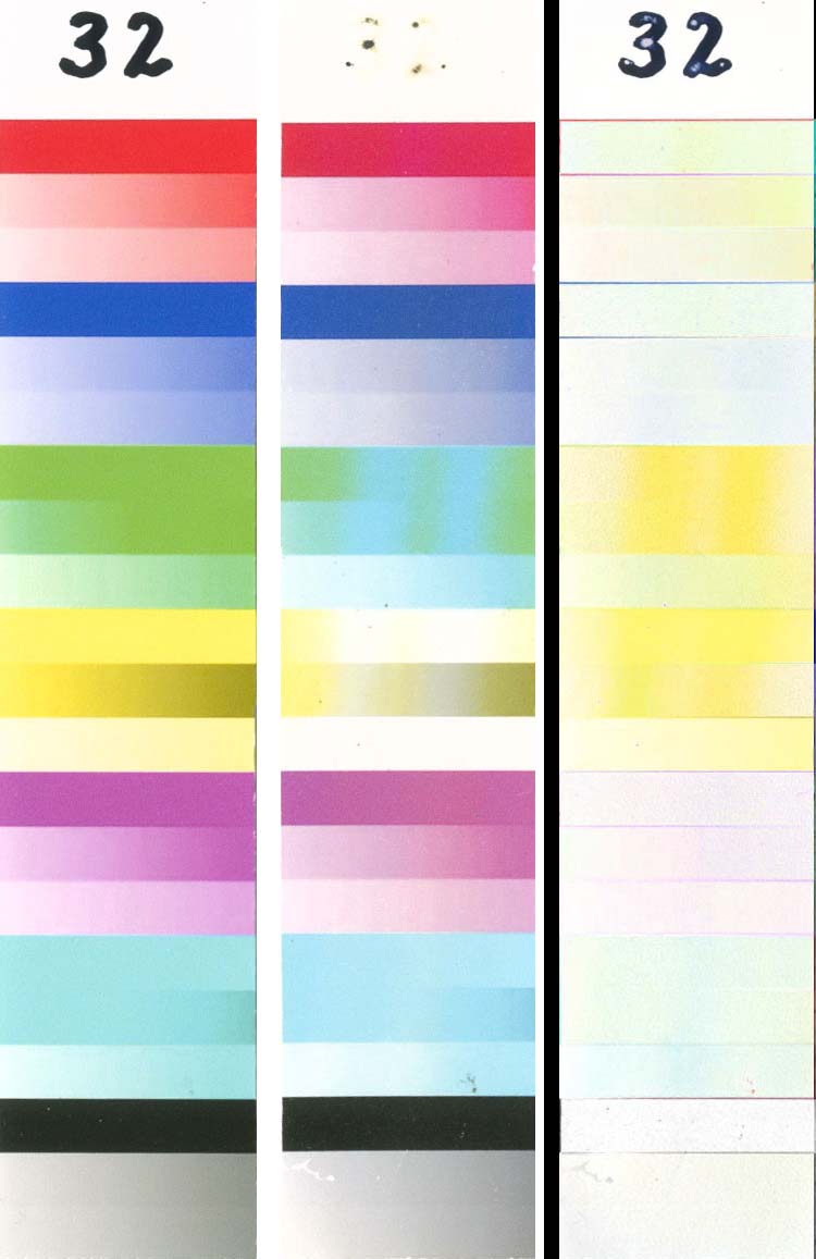
A second baseline is Sample 32 (after 480 hours!) – it was printed with Epson pigmented inks on Epson paper, and is rated at> 100 years by Wilhelm. The magenta and Cyan have faded very little, even after 480 hours on test (by far the best performance of any sample that was tested), but the yellow is almost completely faded by this time. It is also very interesting that the gray gradients did not take on a strong blue color cast as would be expected with the loss of yellow. This sample was printed on a large format Epson printer by a professional photographer, and it is suspected that several gray inks were used to print the grayscales, not a mixture of C/M/Y as is usually done on most printers.
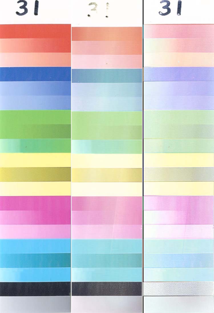
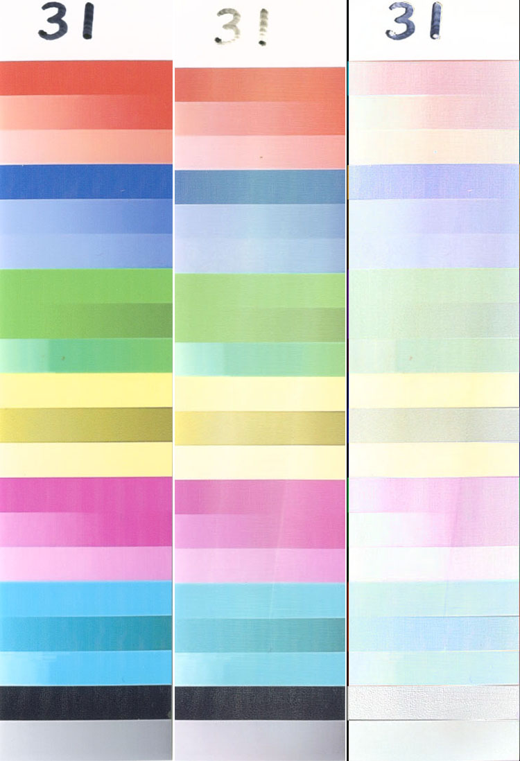
A third baseline is Sample 31 – printed with HP inks on HP paper and rated at>60 years by Wilhelm (shown after 240 hours on test). This sample shows fairly uniform fading on all colors, so it might be acceptable at higher degrees of fading than if the colors faded non-uniformly.
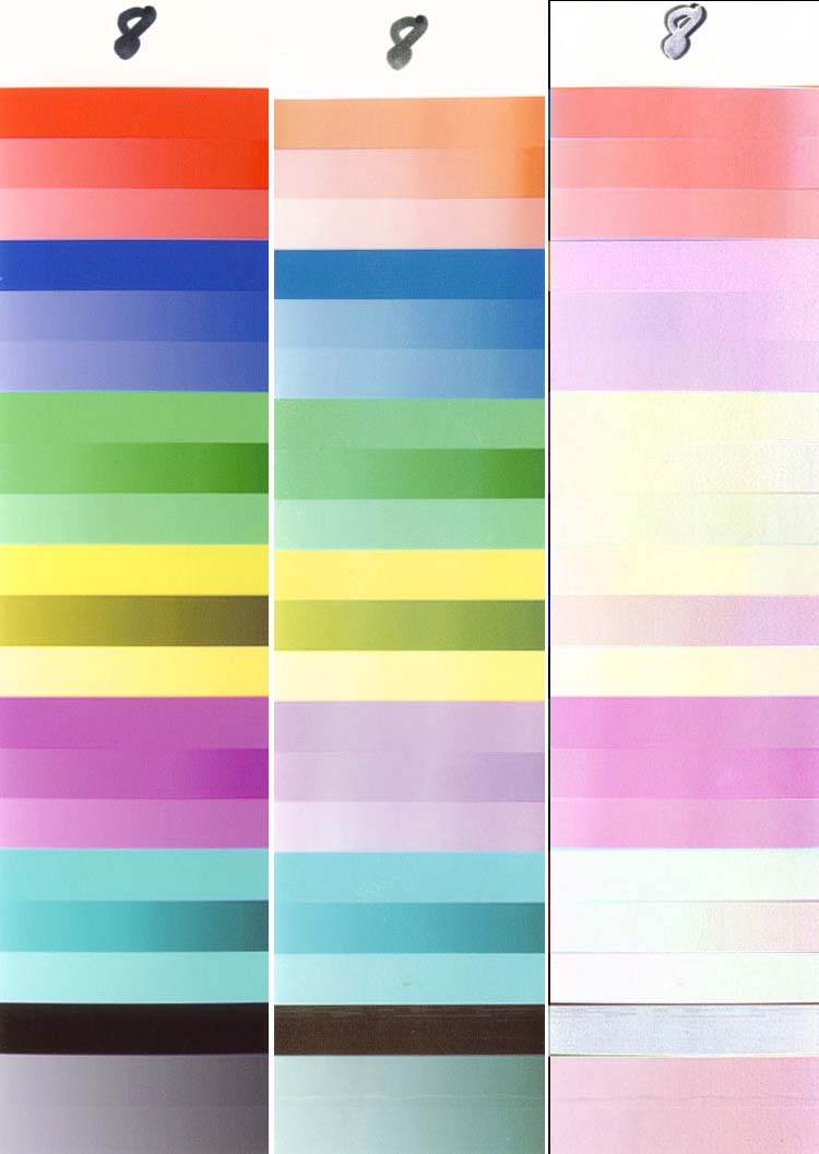
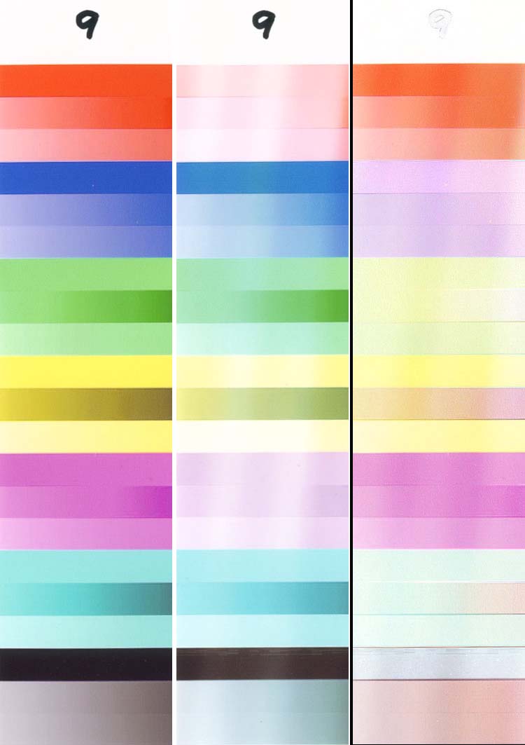
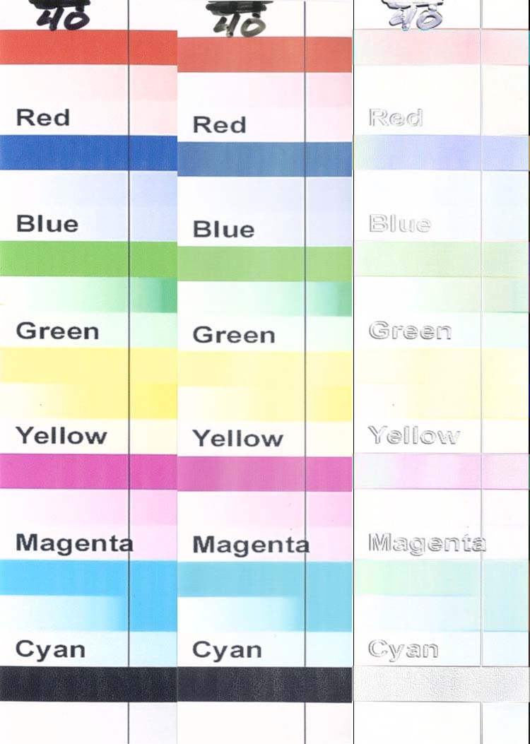
The following is a short description of things that were noted on each sample and details that might not be obvious on the images. Note that some of the samples have been tested for longer times than those used in these comparisons, so look in the individual folders to see the complete details. This animation shows a comparion of all of the samples after the same 96 hpurs on test:

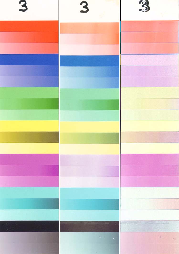
Sample 2 is a print made at Costco and printed on Fuji Crystal Archive at 168 hours. The FCA prints were darker than average, and most of the fading is seen to be in the Cyans.
Sample 3 is Formulabs printed on Canon’s Photo Paper Pro at 96 hours. Note that most of the fading is in the Magenta. The cyan and yellow are still quite good. If they can get the Cyan this stable, why can’t they do the same for the Magenta? This Magenta fading problem is typical for all of the 3rd party inks that we tested. The coating on all of the PPPro samples cracked if they were folded backward even slightly. This isn’t a problem as long as the photos are kept flat, but we had to wrap the samples around the bulbs and they cracked when they were straightened to fit into the scanner.
Sample 4 is the same as (3), but coated with a non-UV absorbent spray acrylic coating from Wal-Mart. As expected, there was little/no improvement in UV fading.
Sample 5 is the same as (3), but coated with a single brushed coat of ClearShield UV absorbing water based acrylic clear coat. This single protective layer was effective in reducing the fading rate. The dot in the red is where the Coating stuck to the light (due to the heat) and pulled off a small section of ink/paper. This is what (5) looked like at 144 hours. The streaks at various places are brush marks (I used a 40 cent throwaway brush to coat these samples – remember that “low cost†was one of our goals).
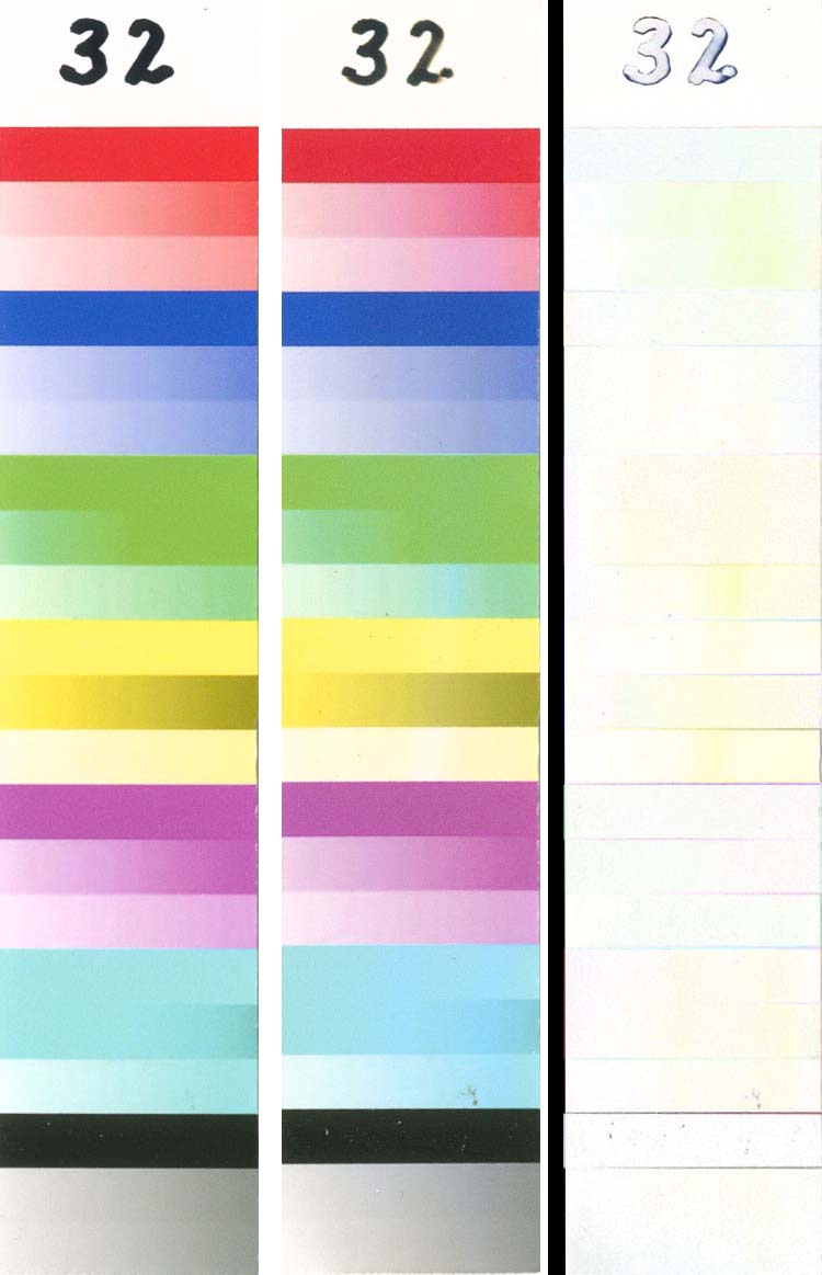
Sample 6 is Formulabs printed on Kirkland 8.5×11 paper (manufactured in Switzerland) at 96 hours. The Kirkland paper shows more fading than the PPPro (3), especially in the yellows.
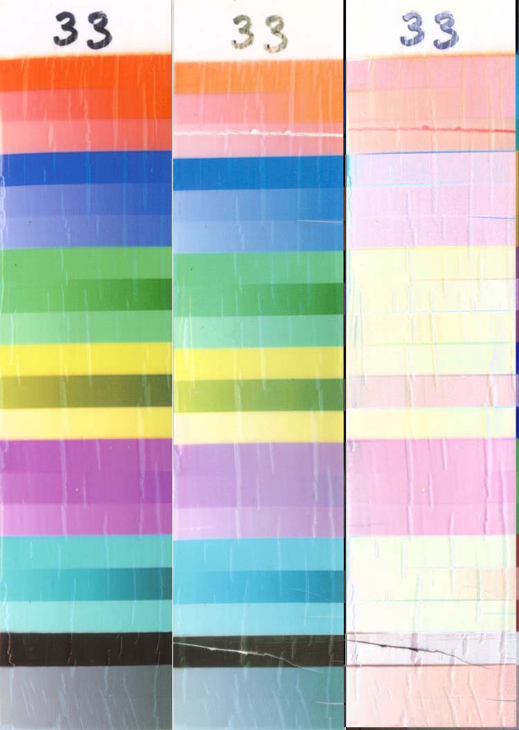
Sample 7 is Formulabs printed on Kodak Ultima (a combination swellable/nanoporous paper) at 96 hours. Sample 8 is Formulabs printed on Ilford Classic Pearl (ICP – a swellable paper) at 96 hours.
Sample 9 is similar to (6), but the Kirkland paper is the 4×6 size manufactured in the US.
Sample 10 is the same as (2), but it received a single coat of ClearShield. Strangely, it shows more fading, especially in the yellows – just the opposite of what was expected.
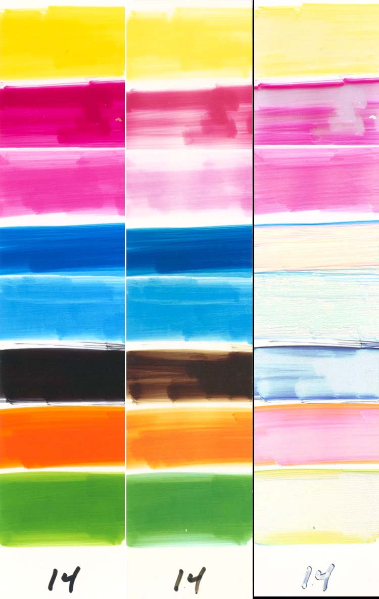
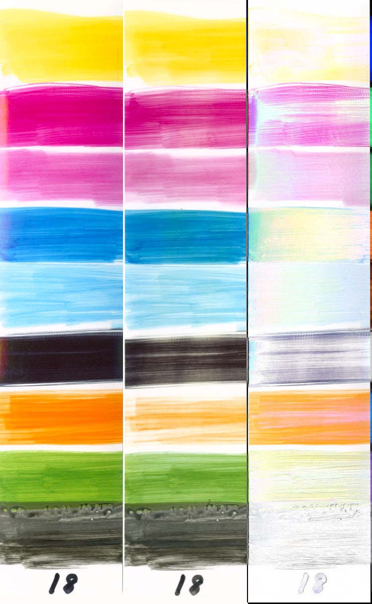
Sample 11 is Canon ink swabbed onto PPPro at 168 hours. The PM, Red and Black show the worst fading. Since very little Black, Red and Green are used in printing photos, only fading in M/PM/C/PC/Y are really problems.
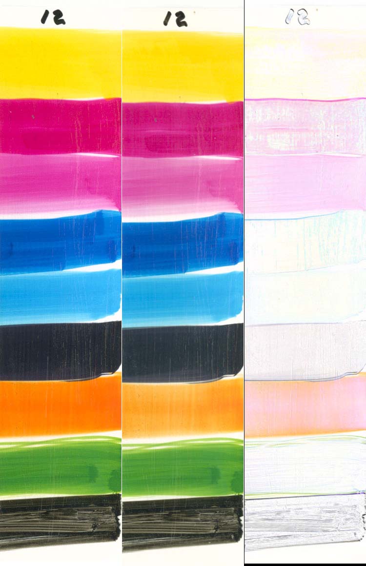
Sample 12 is the same as (11), but coated with ClearShield. Brush marks from the coating are obvious, but so is the reduction in fading. The pigmented strip at the bottom is typical of what happened on all of the swabbed samples that have the pigmented strip – it is very streaky and the pixels on successive scans don’t line up perfectly, so the “Diffs†look strange on the pigmented blacks.
Sample 13 is Formulabs swabbed onto PPPro at 168 hours. The PM, Magenta and Black show fading.
Sample 14 is G&G swabbed onto PPPro at 168 hours. The Magenta, PM and Yellow show fading.
Sample 15 is WeInk BCI-7 swabbed onto PPPro at 168 hours.
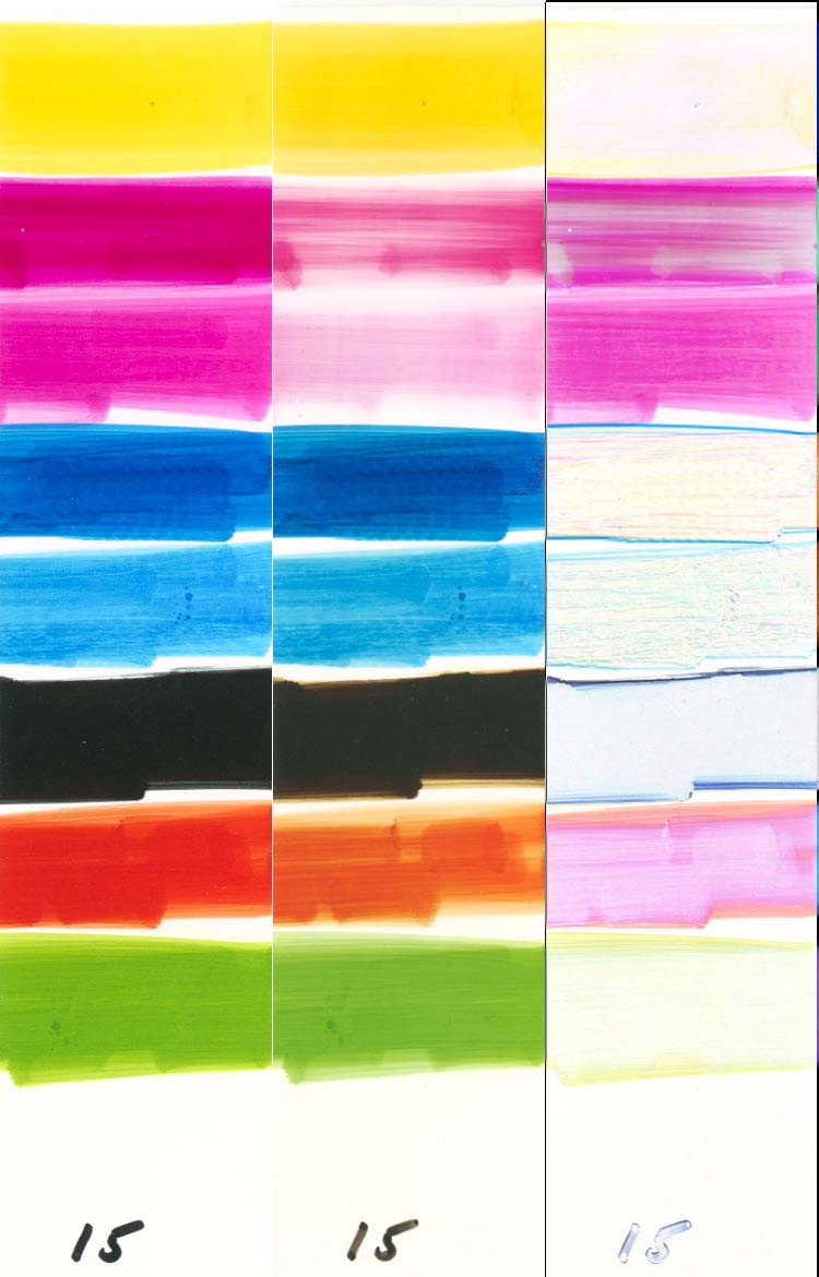
Sample 16 is Canon ink swabbed onto Kirkland 8.5×11 paper at 168 hours. Compared to (11), the PM is better, but the Yellow is worse (so is the red, but Red doesn’t really matter).
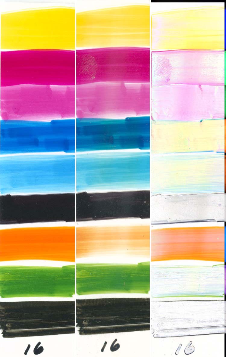
Sample 17 is Canon ink swabbed onto ICP paper at 168 hours. The original sample was curled along its vertical axis, and the edges of the original scan are slightly off from the actual color intensity, making the edges of the “Diff†appear to be faded.
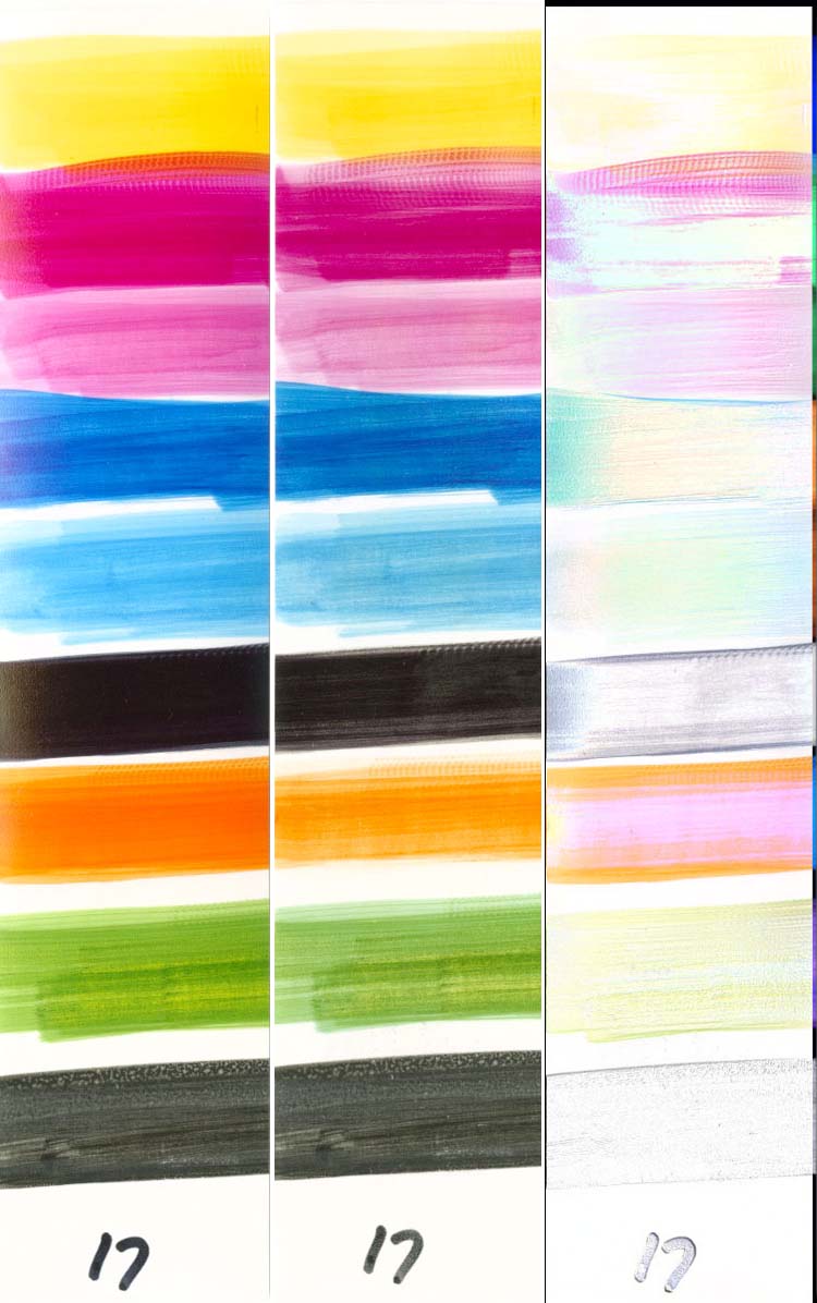
Sample 18 is Canon ink swabbed onto Kodak Ultima paper at 168 hours.
Sample 19 is Canon ink swabbed onto Epson Glossy Photo Paper at 168 hours.
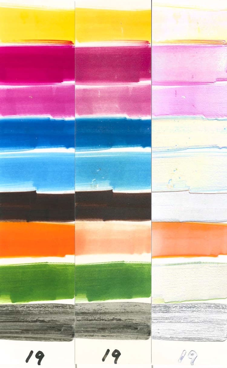
Sample 20 is WeInk BCI-7 ink printed on Kirkland 8.5×11 paper at 96 hours.
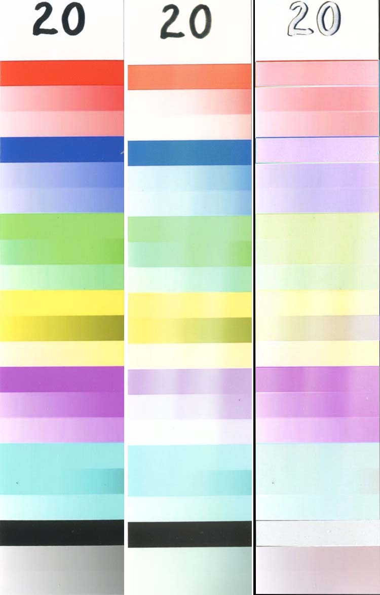
Sample 21 is WeInk BCI-7 ink printed on Ultima paper at 96 hours.
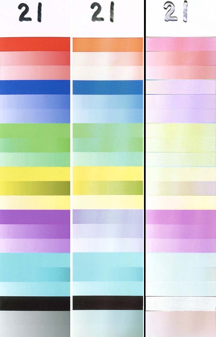
Sample 22 is BIJC#2 ink printed on Kirkland 8.5×11 paper at 96 hours.
Sample 23 is BIJC#2 ink printed on Ultima paper at 96 hours.
Sample 24 is Canon ink printed on Kirkland 8.5×11 paper at 96 hours.
Sample 25 is Canon ink printed on Kodak Ultima paper at 96 hours.
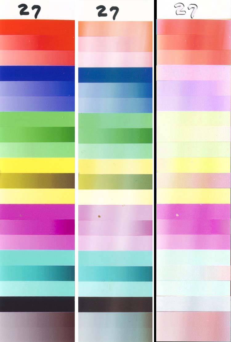
Samples 26/27 are the same as sample 6, but printed at different intensities – this was discussed earlier.
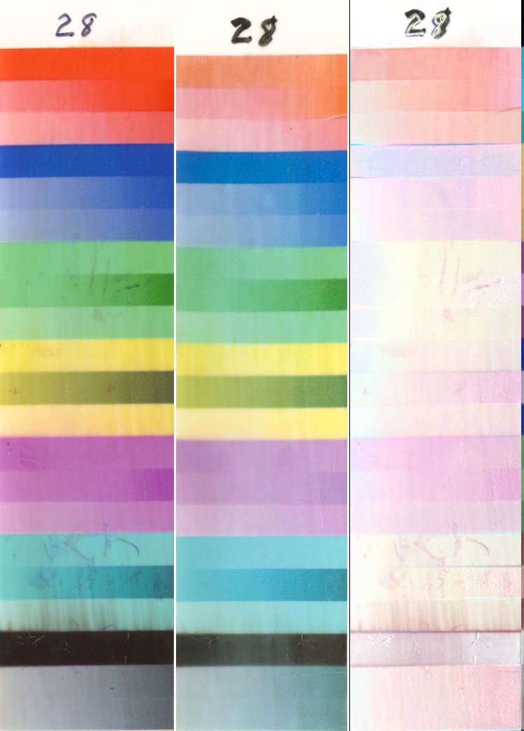
Sample 28 is the same as (8 – Formulabs on ICP) at 96 hours, but with 2 coats of ClearShield. This paper/coating combination shows promise to reduce fading on 3rd party inks, but it will require some work to learn how to coat ICP with ClearShield. The problem is that ICP is a swellable paper and getting the surface wet “melts†the surface, causing the inks to smear (sharp images will become soft). Since ClearShield is a water based coating, it is obviously not possible to prevent the paper from becoming wet. Look at the left of the image, where it is clearly visible that the black ink was smeared by the brush, even after the print had dried for 2 days before the coating was applied. To coat this paper with ClearShield, it is probably necessary to first use one of the solvent based sprays to seal the swellable coating, then apply the ClearShield. However, if you have ever used one of the solvent based acrylic sprays you know how they smell … and smell … and smell … and smell. The water based coatings are almost odorless by comparison, and certainly not as noxious.
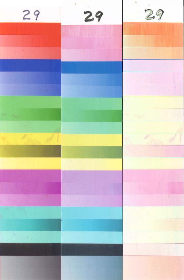
Sample 29 is Formulabs ink printed on Kirkland 8.5×11 and coated with 2 coats of ClearShield. The nanoporous Kirkland didn’t suffer from the same coating problems as the ICP. Samples 29a-d were only tested on the Ozone test.
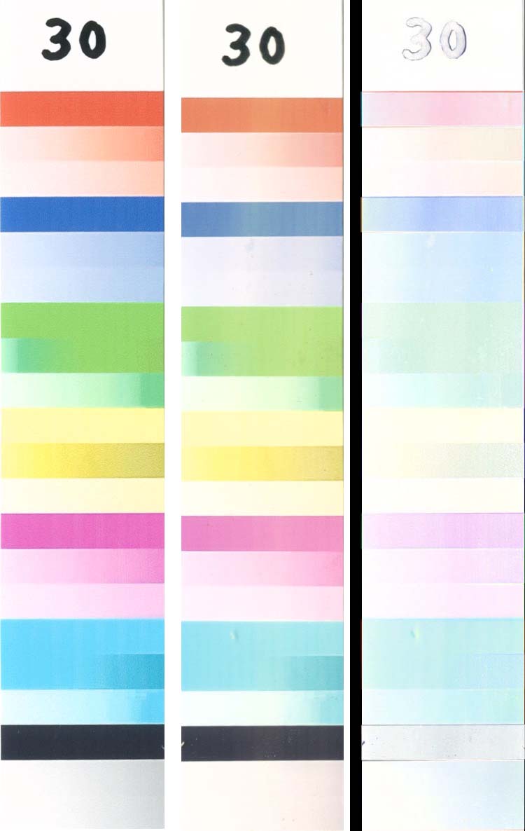
Sample 30 is HP ink (57/58 carts) printed on Kirkland 8.5×11 paper. It is interesting that these inks don’t show fading in the Magentas, but fade in the Cyans (which don’t fade on most other inks).
Sample 31 is HP ink (57/58 carts) printed on HP paper at 144 hours, and was discussed previously.
Sample 32 is Epson pigment ink on Epson paper at 144 hours, and was discussed earlier.
Sample 33 is Formulabs ink printed on Kodak Ultima and coated with 2 coats of ClearShield at 144 hours. As with the ICP, there are obvious problems with how well the coating flowed, but the Ultima did not smear like the ICP. This combination was brittle, as can be seen from the cracks at the top and bottom. These samples “took a set†when they were on the lamps and had to be straightened enough to lie on the scanner and flatten when the lid was closed – the cracking occurred when they were flattened. This won’t be a problem on “real†photographs unless they are abused. This combination (Ultima/ClearShield) gave the best results on 3rd party inks, and offers a reasonable alternative for users of those inks who occasionally need to print a photo with acceptable longevity.
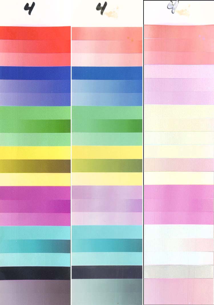
Sample 34 is MIS ink printed on Kirkland 8.5×11 paper at 96 hours. This sample is darker than most of the other printed samples.
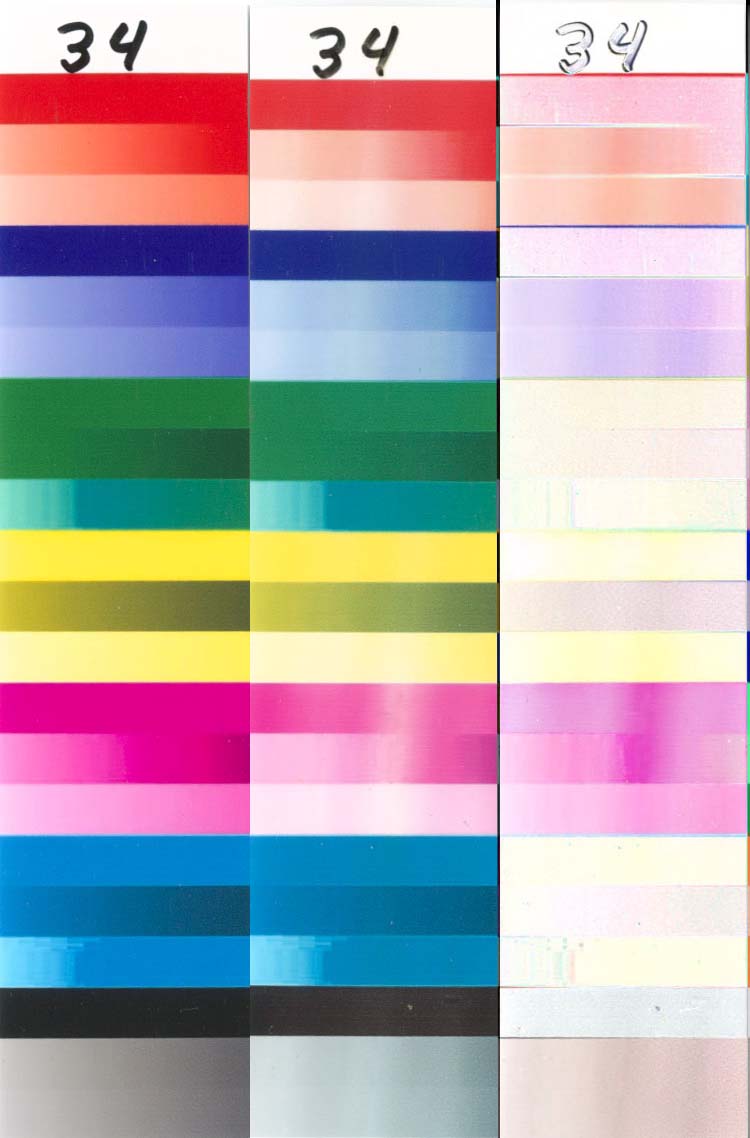
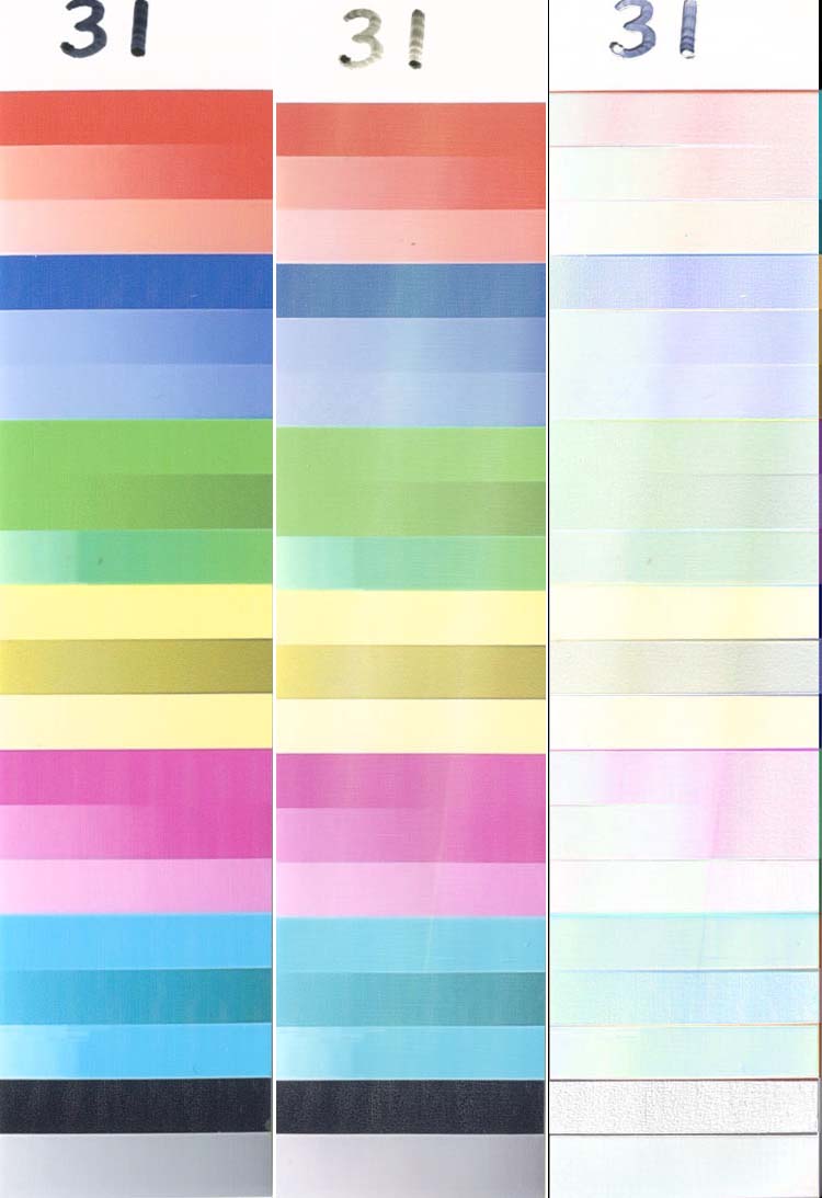
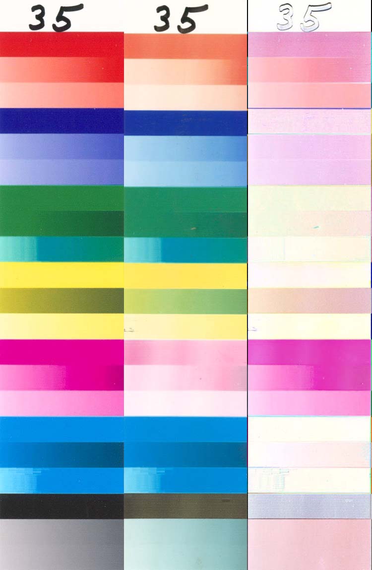
Sample 35 is MIS ink printed on PPPro at 96 hours. This sample is darker than most of the other printed samples.
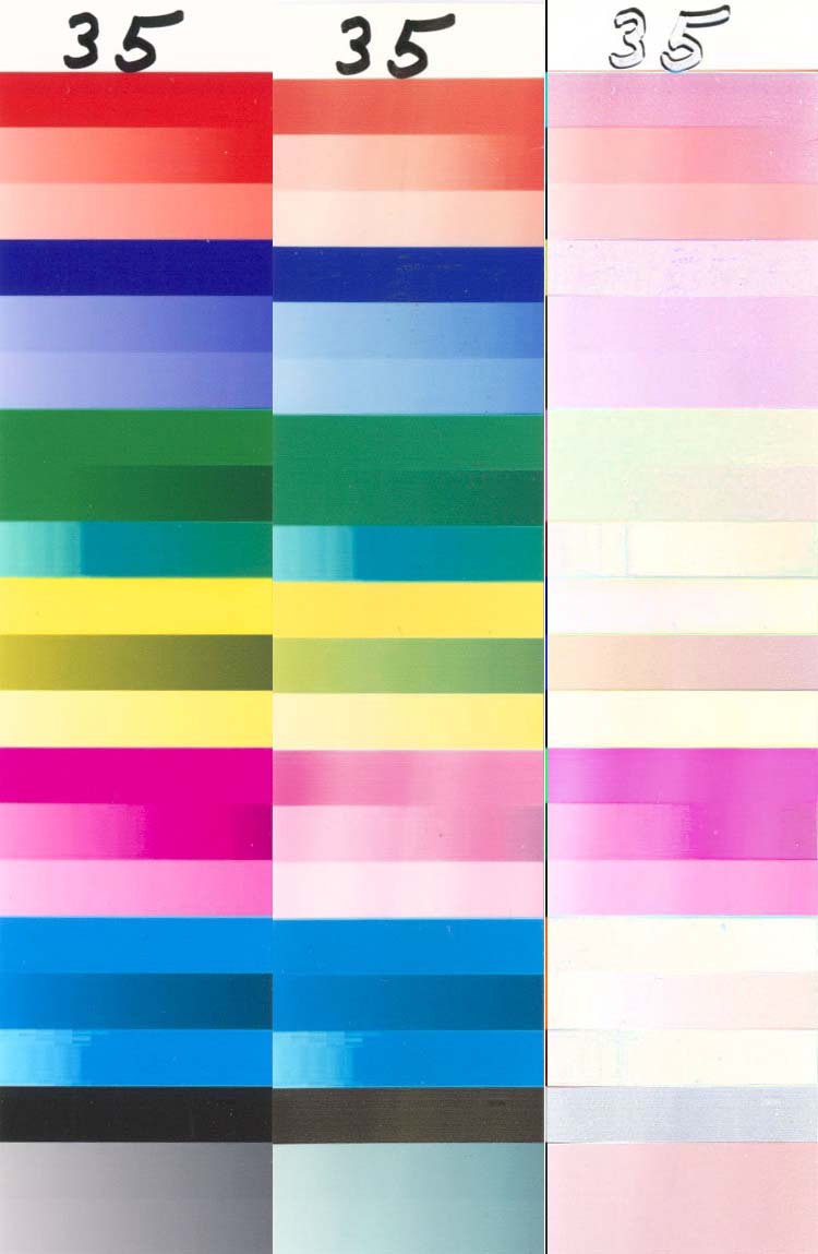
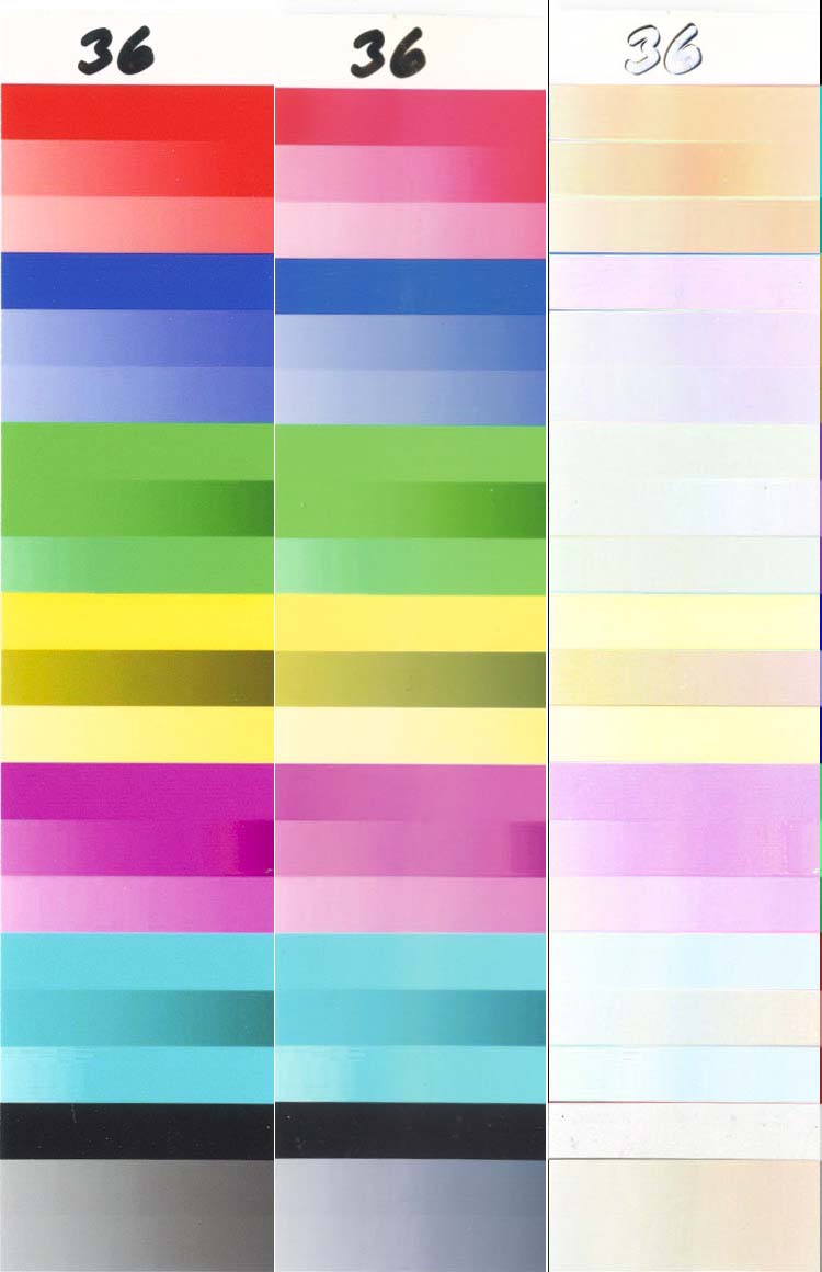
Sample 36 is Canon ink printed on Canon Photo Paper Pro at 96 hours, and is the benchmark for Canon’s OEM longevity.
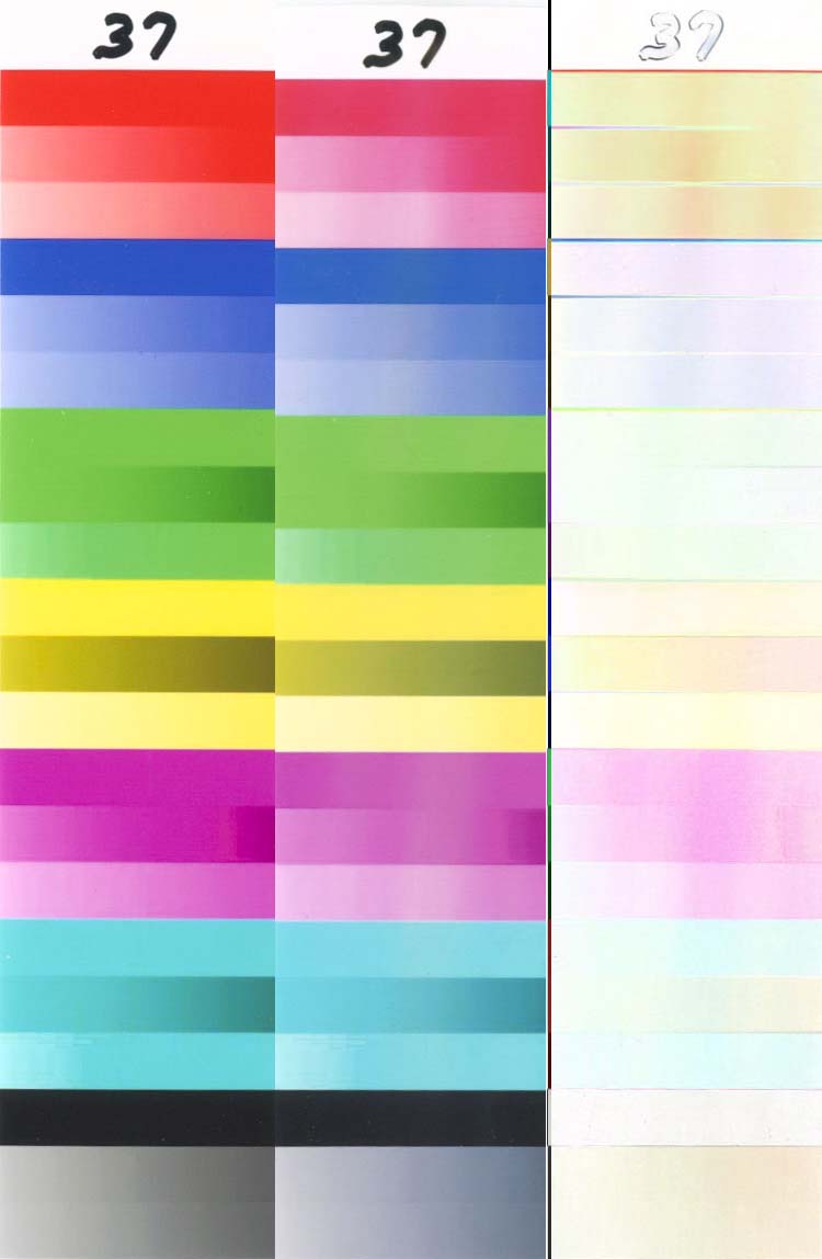
Sample 37 is Canon ink printed on Canon Photo Paper Plus at 96 hours.
Sample 38 is Canon ink printed on Epson Glossy Photo Paper at 96 hours.
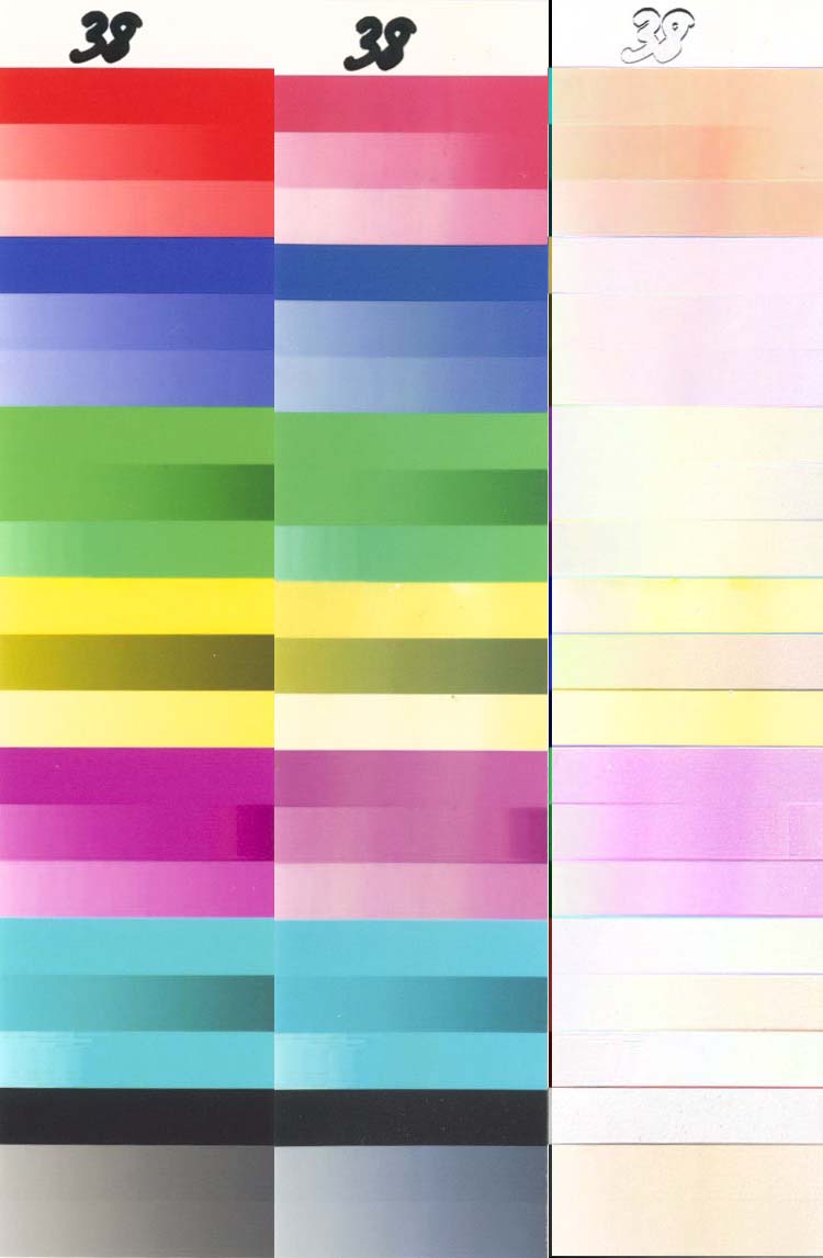
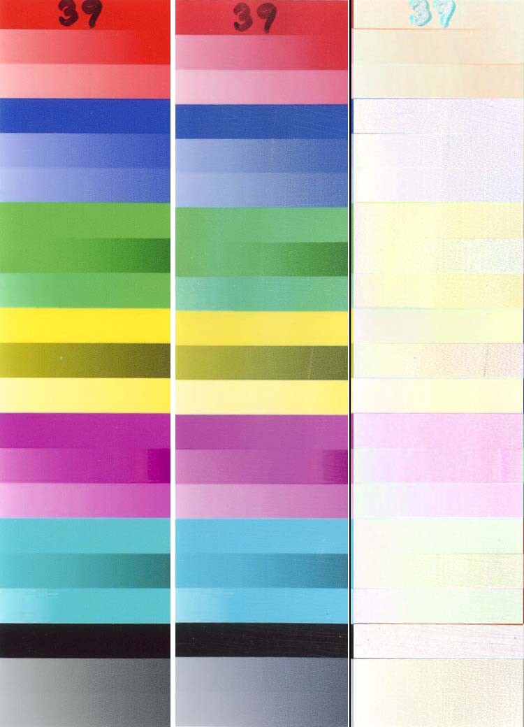
Sample 39 is Canon ink printed on ICP paper at 96 hours. Compare this sample to (36) – Canon is missing an easy way to greatly improve the longevity of their inks simply by using a swellable paper (like HP does). If you are using OEM Canon ink, take a good look at this combination, both from a UV and ozone fading point of view. Here is the HP/HP combination also at 96 hours for comparison. It could be argued that the Canon ink/ICP combination is at least as good as the HP/HP combination – maybe even better, depending on your personal preferences.
Sample 40 was cut from the same print as (31), but from the far left edge, where the gradients were the lightest, and was included for comparison because samples 20-25, 30 and 32 were cut just to the left of center instead of on center.
Sample 41 was cut from the same print as (31), but from the far right edge.
For further reading, here are a few more links on the subject of UV fading:
(1) (2) (3) (4)
Ozone (gas) fading
As was mentioned above, similar tests were also performed on ozone fading. These tests are covered in this report.
What’s Next?
It is clear that not all of the ink colors have fading problems. Formulabs, MIS and WeInk BCI-7 are weak in the PM and Magenta, G&G in the PM, Magenta and Yellow, and Canon mainly in the PM. We have been in contact with a few ink suppliers to discuss what it would take to improve the longevity of their troublesome colors so that their inks would be competitive with the OEM inks. We will not directly quote what we were told, but it boils down to “Bulk ink is a very price competitive market. The ink formulators have the technology to improve the longevity, but it would increase the price of the ink (to perhaps double the present price) such that no one would buy it.†They feel that the vast majority of their customers are printing throwaways, and that longevity is of no concern to most people. They may be right, but it would be interesting to find out how many people ARE concerned about longevity. A thread has been started where you can post your opinion on this subject. If enough customers are interested in improving the longevity of their 3rd party inks, perhaps the ink suppliers will listen and react.
Summary
This is a lot of information to digest, but here are a few special points of interest that deserve repeating.
· Dark prints last longer than light prints.
· Canon inks give better UV resistance than any of the 3rd party inks that were tested.
· Canon ink printed on a swellable paper gives a better longevity than when it is printed on Canon paper.
· 3rd party inks can give a decent longevity when printed on Kodak Ultima and coated with 2 coats of ClearShield. It is probable that this will also help Canon ink, but this combination was not tested. It is also possible that conventional swellable papers can be used if they are first sealed with a solvent based sealer before the water based sealer is applied to prevent smearing the ink.
· Epson pigmented inks gave (by far) the best ink performance. If their Yellow ink had the same fading resistance as their other inks, this combination would be even better (but once you get past 100 years, does anyone really care).
· It is obvious that the swellable papers are far superior to nanoporous papers when it comes to gas fading.
· Coating a nanoporous print with a sealer is a good way to improve the gas fading resistance for those prints that won’t be mounted behind glass.
It should be mentioned that Livick did a lot of work in this area, but that he recently pulled his work from his site as explained here. For those who haven’t read his work, it is still available (thanks to the waybackmachine). What happened to Livick is one of the reasons why it was decided not to post a lot of detailed analysis, but to just present the raw test results. You are encouraged to use this information to analyze the data as it applies to your situation and to post your analysis on the Nifty-Stuff forum. You are also encouraged to build your own UV test rig and to begin testing your own ink/paper combinations. Please post your findings.
first detailed analysis of longevity of printer inks i’ve read and I appreciated your thoroughness. there are so many factors it is impossible to settle on one printer being the best in relation to longevity of their inks. right? i am interested in art mainly and the fading of prints in my computer art work. i’ve found that if a print is kept in a dark place on the wall it’ll be ok. but there is a lack of consistancy that is disturbing. some prints fade, others don’t. ugh!
THANK YOU FOR YOUR DETAILED ACCOUNT AND ANALYSIS OF INKS..
I AM INTERESTED IN FADING INKS IN MY COMPUTER ART. SOME DO AND SOME DON’T. UGH! I CANNOT COME TO A CONCLUSION AS TO WHICH PRINTER AND THEIR INKS ARE BEST. I AM IN PROCESS OF PURCHASING A NEW COMPUTER BECAUSE MY OLD POWER MAC WON’T ACCOMMODATE A NEW PRINTER USB PLUG…AND ALL THE OTHER ATTACHMENTS AND SOFTWARE.